Tackling checklist branding
A good friend of mine Rob Hope has played a massive part in assisting me with getting this project going. He has such wisdom in all aspects of web and it's great to be able to bounce ideas off him.
We've spent months trying to come up with a checklist-related name, but no luck. The space is so saturated with hundreds of checklist solutions and checklist-type domains are also heavily squatted.
Deep inside the dark rabbit-hole of domain searches, this bit.ly style shortener domain popped up: chl.st – an instant buy, perfect to share checklists. Example: chl.st/OObS7wYh8
(In case you are wondering, the .st domain is for São Tomé and Príncipe – an island country in the Gulf of Guinea)
This domain laid the foundation for the Private Alpha build and unintentionally grew into the main brand.
Failing the radio test
The “radio test” is an old-school branding test, questioning if your potential business name could be said on the radio and listeners able to type it out correctly (finding you). For example: Twitter passes while Fiverr fails. The same test would apply for word-of-mouth conversations.
C-H-L-dot-S-T, what a nightmare of a 6-syllable brand name, but here we are!
As mentioned in the greenlight blog, the only way to get a slice of the checklist pie is through an amazing UX experience that helps strengthen peoples products or services.
Brilliant branding – no question – helps new products spread but taking into account UX being the top of our priority list, along with a distribution/marketing plan via users sharing lists for free, the call was made to stop wasting a second more on it.
Check logo
The brief for the Beta branding: good enough
But what does ‘good enough’ mean? Legible, clean and just enough finesse to make a user feel we are invested in the long run.
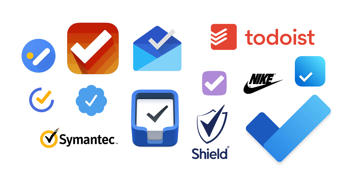
Let’s take a look at some famous checks:
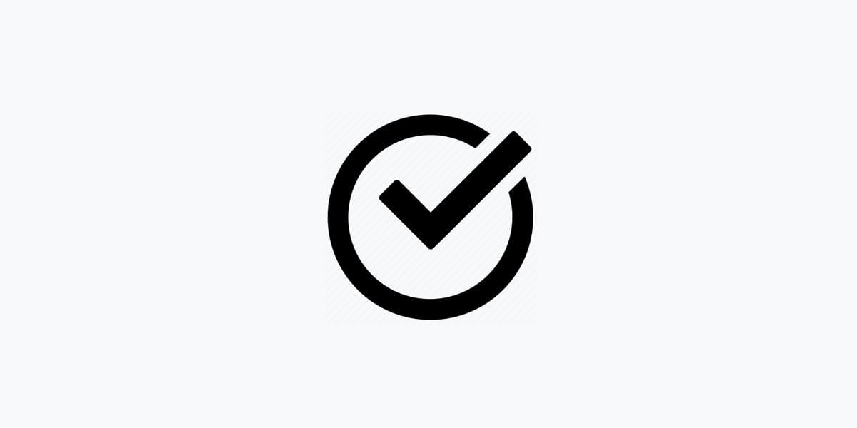
Reminding myself Chl.st has zero users, I decided I’m not going to try make a remarkable check for the Beta (nor have the skills). So I searched “Check Icons” on IconFinder to spark some ideas. This concept was interesting where the tick rides off the edge:
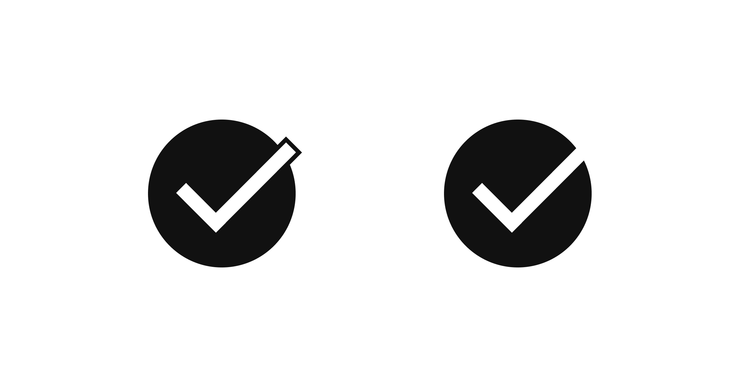
So I spun up these two similar but slightly more minimal concepts in Figma:
While mulling over those two, I dived into some colors. The goal was something that looked intentional.
High contrast pure white/black color schemes personally give me such a bad first impression. Just no love.
So went for something warm. Not luxury, but creamy. Kinda like vanilla dashed with caramel and a drop of chocolate in the middle. Here is the final Beta branding using the simpler of the logos:
I want to add at this point in the journey, that absolutely everything above (domain, name, logo, color scheme) could change but it’s good enough for launching a Beta.
And good enough means the brief was nailed.